Friday, March 13, 2015

Typography Images

Typography is the style of a printed matter made with facts about the person you're doing the typography about. It can be used to make an impact because the words contains facts about the person and we will remember because its part of the image. We can look back to the image and we will visually see words that relate to the person. That's how typography images can make a huge impact in the future.

During this project the hardest challenge for me was placing the portrait on the mask. I couldn't see the images so that was hard but I got the hang of it. I labeled them so I know which is which, then I started doing whats suppose to be done. I overcome this issue by listening to Mr. Sanderl's direction and watching a video. It was pretty easy because Mr. Sanderl and some guy help me, one we watched a video how to make a typography image and that helped me a lot. I had some struggles on making our teacher portrait but by the end, I actually helped a lot of people to get done. So I know that I clearly know how to make a typography image.

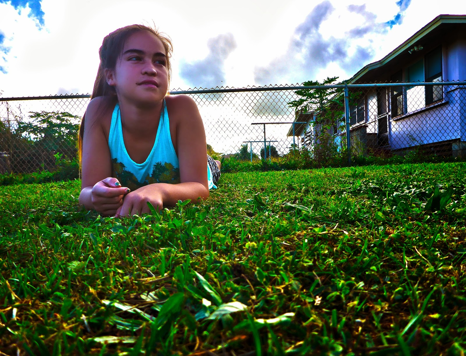
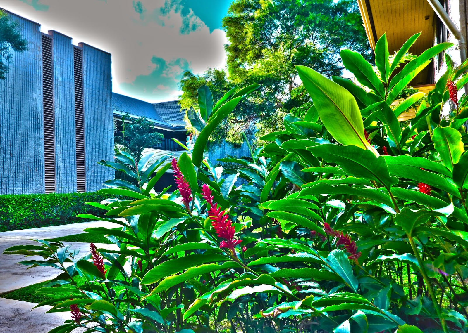
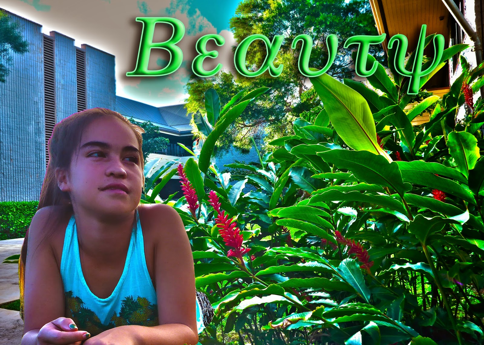
My four visual examples as shown is my typography portrait of my teacher of my choice, how I started from scratch then to an amazing image. One of them was our practice typography portrait and then we stepped forward to a more higher expectations. We made our final image look like its a real-life photo. I am very proud of my final and practice because you can tell how we really took a step forward to a higher, advanced, tutorial image.  What makes my practice different from my final is because we colored the words and you only see words and not the face, the words outline it. My favorite one is my final because I learned how to challenge myself to finish it correctly and to make it perfect. Now I know how to make a typography portrait like a professional person.


Friday, February 20, 2015

Double Exposed Portraits

Portrait Photography is a picture of a person or two and the picture expresses the person's feelings, mood, and personality. The main focus is the person's face, the body and background may be concluded with the image. Portrait Photography could relate to a profile view and silhouette because they do something with the person's face. Profile is an outline of the person's image and silhouette is an image of a person or an animal that is black and outlined black which make the whole image black. We will use the outline of our face and blend in pictures within our faces to make it look amazing.

Double exposures are created in Photoshop by following these steps. Step 1-9, this will help you learn how to make a double exposure image in Photoshop. To get your images in Photoshop you have to go to: File>Script>Load Files Into Stacks>Browse>Take your three images>Start. If you are a person that likes photos that are blended into each other then you'll want a double exposure image. It combines 2 images that symbolizes you and the side of your face, and from there your going to blend them together to make a double exposure image.


My symbols are parts of nature, this represents me because I love nature. I have a flower and a t-leaf flower. It's very unique and there's a lot of things to explore, and that's what symbolizes me. My quality could improve if I would've took a picture of the sunset or something like that about the sky. Although, there's only a few things I can take a picture of around my house, so it's limited. Also, I would've improved if my portrait picture shows more of my face and not that much of my hair, because my hair takes up three fourths of he space on my face. That's it for now, and keep in touch because we have more blogs to post.

Monday, February 9, 2015

HDR Photography

HDR Photography is drawing with light, HDR Photography is used for taking pictures and you can take more than 3 pictures in different exposure levels. What I dislike HDR Photography is that you take a long time to adjust the exposure because of where the buttons are at. What I love about HDR Photography is that we can make a picture that we created and edited by our own.

If you want to know how to make an HDR image you need at least 7 images in different exposure levels. Then you have to go to Photoshop and go to File>Automate>Merge to HDR Pro>Browse then you pick your 7 photos that you took and start compiling them to make a realistic image using all 7 photos. I will guess about this, but I think that HDR is different from automatic HDR because your the one who's taking the picture and its not going to do it for you.

For my HDR landscape and experiment, the thoughts that went to it is, it needs to be surrealistic and it has to meet the expectations. I never worked so hard on a project like this one, we had to have 7 photos in different exposure levels, for landscape we had to get the sky and the foreground which was a struggle for me. When I was going through the process on making my HDR photo, I went through a lot of complicating things like how to put the levels in the right space, and that's it for now I hope I helped you guys on how to make an HDR image.


Wednesday, January 21, 2015

Movie Trailer Critique


Our project is about a Lego Man dreaming about him in another type of person. My teammates are Alaka'i Gonsalves, Kacie Burns, and Meleana Keawe, our trailer plan as you can see has all the information we needed to do to make our movie trailer work out. I contributed by writing the voice acting script and helping out to make the synopsis.  All of my teammates contributed in some ways. It was a tough trailer to make, especially that we have an animated trailer.

Our project requirements were our trailers needs to be 1 minutes 30 seconds to 2 minutes 30 seconds, foley, movie poster, 5 scenes, VO (voice acting script), text layovers, and dialogue. We almost completed the requirements but we only missed a few. Like foley and we only did a few dialogue, and if you wanted to know what foley is, here it is. Foley are everyday sounds like clapping your hands, stomping, whipping a whip, and typing.

I do agree about our critiques, even though we only had 3 votes. We could've done a real life trailer but we did a Lego animation. Yes, animations are hard and we never learned about animations yet, but at least we tried and we were the only team that did an animation trailer. We got a lot of compliments from our teacher how we did a good job on doing a different trailer, and I felt special because our trailer was unique. We didn't really want ours to be the best and all the people voting for ours, we did expect that we have 3-5 votes.


Friday, December 12, 2014

Movie Poster Promo

The main character all of you are going to see is Sir Victor. He is the main character because he is going to be the star or the main light of our movie poster. Sir Victor is looks like his flying although its just him looking evil and ready to strike. 

My title is very beautiful, with a fish eye look, outer glow, drop shadow, and of course, the sparkling font. When you see it, it really looks like Sir Victor's dream font. My teams name's are going to be on the poster with some keywords. If you like a font that looks so fancy and beautiful, although the spacing is really close you need to use kerning. Kerning is used to give fonts space if their really close together. We use kerning to make our fonts look like what we want it to be.

The overall impact on my poster, like the filters, effects, and layers gives my poster the "dreamy look." It looks fabulous and amazing, I did expect my poster to be this nice. The words are popping out, images looking amazing, drop shadow making the font look nice and dreamy, and the fish eye look, the best on of all. This look would make you think that the words are circling around the poster, you feel like its going to take you in and you'll experience the joy. The joy that's going to make you feel that you already know the movie trailer, how its going to go and how its going to feel.


Wednesday, November 26, 2014

Proactive or Procrastination?

I suppose that I'm a proactive person because I have and I get good grades. I use my time wisely and I use every second to do my work. When I have free time I study but sometimes I play. My free time gives me a lot of time to think, play, and be who I am. Even though I play I still learn while playing, it bothers me when I don't get my work done. That's why I'm a proactive person, never do I have thought of being a procrastinator. (Although sometimes I do.)


When I get home I watch television for like 1 hour then I do my homework. After that I go to my Ipad and do work on the internet like my blog, movie trailer, and my Yearbook Plan. If I'm done with all my homework I play, watch, and play again. I do get A's on my classes, and yes I know that I should focus on my studies and let the playing on the side. I do maintain a healthy way of living, using time wisely, and I know when to do my work and when I can play around.

What I would change about my work habits are going to be listed: Don't play around, do something when I'm done with all my work, something that doesn't distract me and don't go off task. These three things are the things I mostly do. I need to change that to be a proper proactive person. Sometimes I have trouble to not do these things, and yes it does bother me. I can't stop myself from doing these things, but if I try would probably achieve my goal to not even try or do the top three things.


Friday, November 7, 2014

My Visual Poem


BautistaK VisualPoem from Kapaa Middle School MEDIA on Vimeo.

My Visual Poem is about my surroundings or nature. I picked nature because its very important to us, without it how are we suppose to live. Also, I wanted people to really look at what we have and tell them that nature is the only thing that we need. This is how we built up all the things we have today. I wanted to show that I love nature and share my surroundings with all of you. The Visual makes an impact by showing what we have, all the important things that we need.

I didn't really add any effects expect for the transitions. It don't think that it changed any color, mood, and lighting to it. If you see any change then I'm probably blind. Although, the transition and my titles does effect my video because it has this good camouflage and the transition is smooth. I like that does transition existed.

We never critiqued ours yet so there are no results. All i'm hoping for is a 4, and yes that's a high score that I want, but it's not bad to dream right. Next week we will critique our poems and we will critique it on our own blogs. I'm just hoping for the best.