 HDR Photography is drawing with light, HDR Photography is used for taking pictures and you can take more than 3 pictures in different exposure levels. What I dislike HDR Photography is that you take a long time to adjust the exposure because of where the buttons are at. What I love about HDR Photography is that we can make a picture that we created and edited by our own.
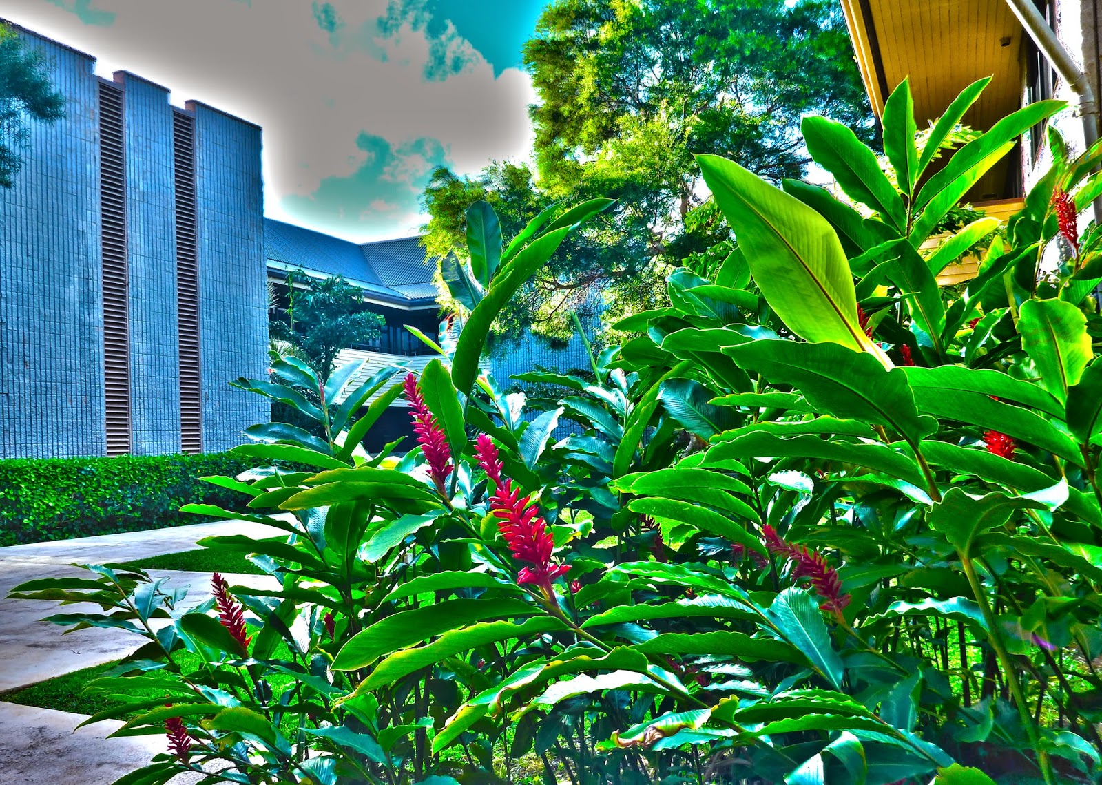 If you want to know how to make an HDR image you need at least 7 images in different exposure levels. Then you have to go to Photoshop and go to File>Automate>Merge to HDR Pro>Browse then you pick your 7 photos that you took and start compiling them to make a realistic image using all 7 photos. I will guess about this, but I think that HDR is different from automatic HDR because your the one who's taking the picture and its not going to do it for you.
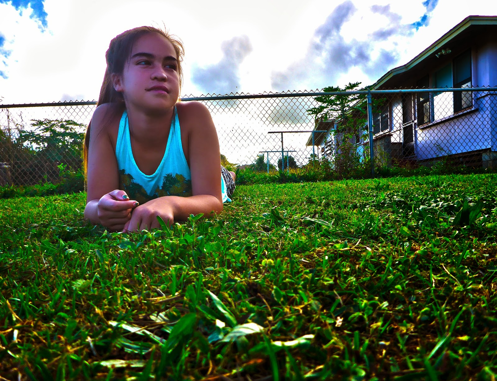
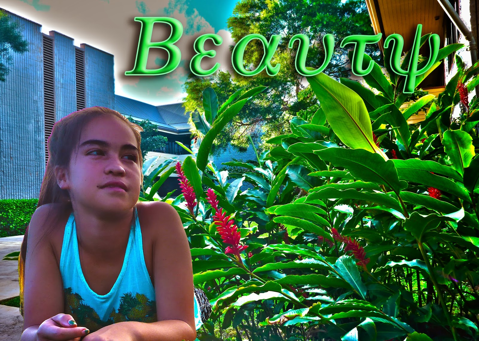 For my HDR landscape and experiment, the thoughts that went to it is, it needs to be surrealistic and it has to meet the expectations. I never worked so hard on a project like this one, we had to have 7 photos in different exposure levels, for landscape we had to get the sky and the foreground which was a struggle for me. When I was going through the process on making my HDR photo, I went through a lot of complicating things like how to put the levels in the right space, and that's it for now I hope I helped you guys on how to make an HDR image.
The cutout is really good.
ReplyDeleteText font could be better
I like the landscape It's really good!
Great surrealism! Vibrant colors!
ReplyDeleteEyes need to be in the rule of thirds.
Great text!
it actually looks like she is in that background
ReplyDeleteHer eyes could be higher
I love how the plants and ashley fit perfectly
I like the text style, it makes the E and the T look cool
ReplyDeleteNot rule of thirds
Nice background
I like the colors
ReplyDeleteCould have moved the subject into the rule of thirds
I like how it looks surreal
I love the word you chose! It describes the picture!
ReplyDeleteOne thing is there are these lines coming out of ashley's head.
I love the landscape.
Lots'a colors
ReplyDeleteNeeds a better font
Great shots
I like the font you used for the text.
ReplyDeleteThe rule of thirds is off.
I like the effects you used on the text.
Your text really blends in with your image really well.
ReplyDeleteThe lighting on Ashley is bright on her hair.
Your cut-out is really well done.
Cool wording color
ReplyDeleteFont could be better\
really surreal
It's great where you put the text.
ReplyDeleteYou could increase the brightness of Ashley.
Great focal point.
i like how she is looking at the words
ReplyDeletelooks like she has no legs
i like the was you placed her
I really like all your color schemes in the whole thing
ReplyDeleteAnd I one thing you could have added a drop shadow to your text layovers
and you did really good on the backround and ashley
I really like how you made ashley looking at the word
ReplyDeleteyou could have decrease the brightness
I love how your picture looks surreal
I like the text
ReplyDeleteyou could make the text a little bigger
I like how surreal it is
The pictures look very surreal!
ReplyDeleteThe word needed to fade out a little more
Awesome job cutting it out
Nice word describing the picture
ReplyDeleteShe looked kinda as if she was floating
Really surreal
I really like how your focal point is looking right at the text
ReplyDeleteYou could've made the text opacity a little lighter
I love your landscape it's very surreal
Awesome Surrealism it pops out.
ReplyDeleteCould've increased or decreased the size of Ashley.
Your Focal Point is Awesome.
My favorite part about your image is the landscape because its colorful and very pretty and eyecatching
ReplyDeleteOne thing that could be improved is brightening Ashley
Your cut out is also PERFECT!
I really like how the word goes with the picture
ReplyDeleteYou could have made her a little bit brighter
I really like how your text stands out a lot
Great color!
ReplyDeleteYour cut-out could have been clearer.
Your background is really cool.
1.I like how Ashley is looking at the text
ReplyDelete2.Your could have turned the brightness down a bit
3.I like the landscape photo
I love how vibrant the colors are in the back round.
ReplyDeleteOne thing I think you could have done better is make the colors of your model better to fit in to the back round.
Nice how you lined up the rule of thirds.
I love how vibrant the colors are in the back round.
ReplyDeleteOne thing I think you could have done better is make the colors of your model better to fit in to the back round.
Nice how you lined up the rule of thirds.