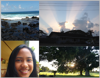
In our new project called Motivational Poster we require 2 text layers, 4 images, kerning, triadic color scheme, visual balance, blending options, personal quotes and our manifesto that we made in our previous blog post. The two text layers are personal and manifesto and the 4 images is our symbols and a portrait picture of us. Kerning is required because there shall be no empty space and the whole entire page should be filled with words filled with our personal quotes and manifesto.
I made my Motivational Poster by having all the things I need like my manifesto and personal quotes. First I created a text box for both of my text layers. Then I left aligned my text so it's easier to create a box, I used the kerning tools to do so. After that, I added my symbolic images and a portrait picture to create my background. Next I started to add my triadic color scheme, adjusted my colors to match my background. It wasn't that hard to do as kerning. After that I adjusted my background by going to Layers> Layer Adjustment and adding color balance to match my text layers. I also added curves but I don't think that's a must. After that I just saved it to a JPEG and turned it in on time.
The biggest challenge I faced and mostly everyone is kerning. Trying to fit everything without any space is just hard. At first I thought that I wasn't going to fit everything together but I did and it only took about a week or less. How I would improve my kerning is just adjusting my text size so it's easier to fit everything together and it doesn't take that much time to try and fit small texts throughout the page. I also think that if I hadn't gotten that much words and could've just had little text so I only had to adjust the text size and fill the page completely easier than the hard way I took.


No comments:
Post a Comment